ANNIE'S BLUE RIBBON GENERAL STORE | Holiday 2020
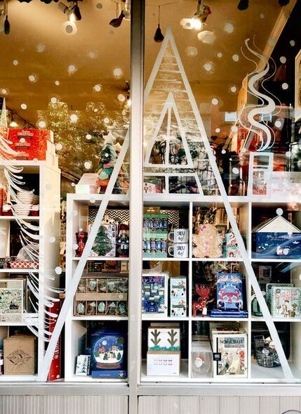
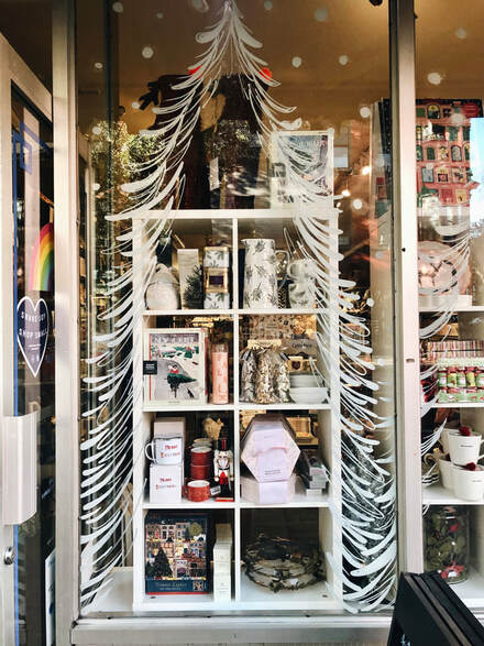
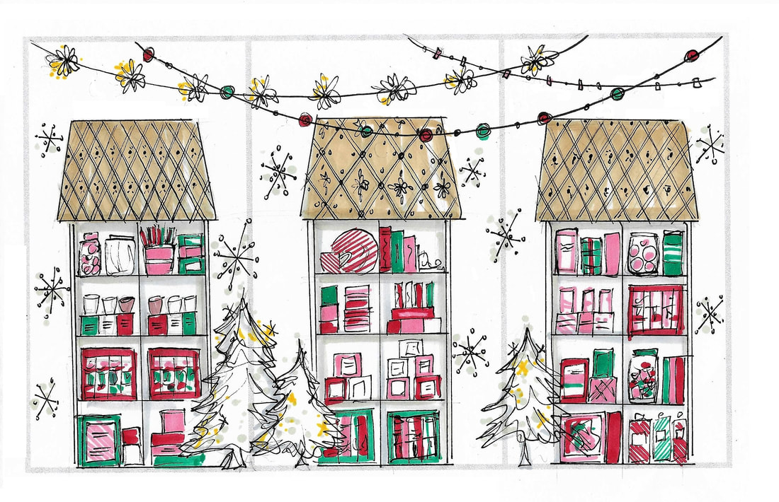
The concept for Holiday 2020 focused strongly on coziness and security, a much needed theme during the COVID-19 pandemic. Windows were transformed into a A-Frame cabin nestled in the snowy woods. Cubed shelving allows the window to be 'shoppable' from outside the store. While brainstorming the 'A Frame' concept, a 2D method was chosen over 3D, as this would have limited the aesthetics in terms of overall proportion/workable surface area.
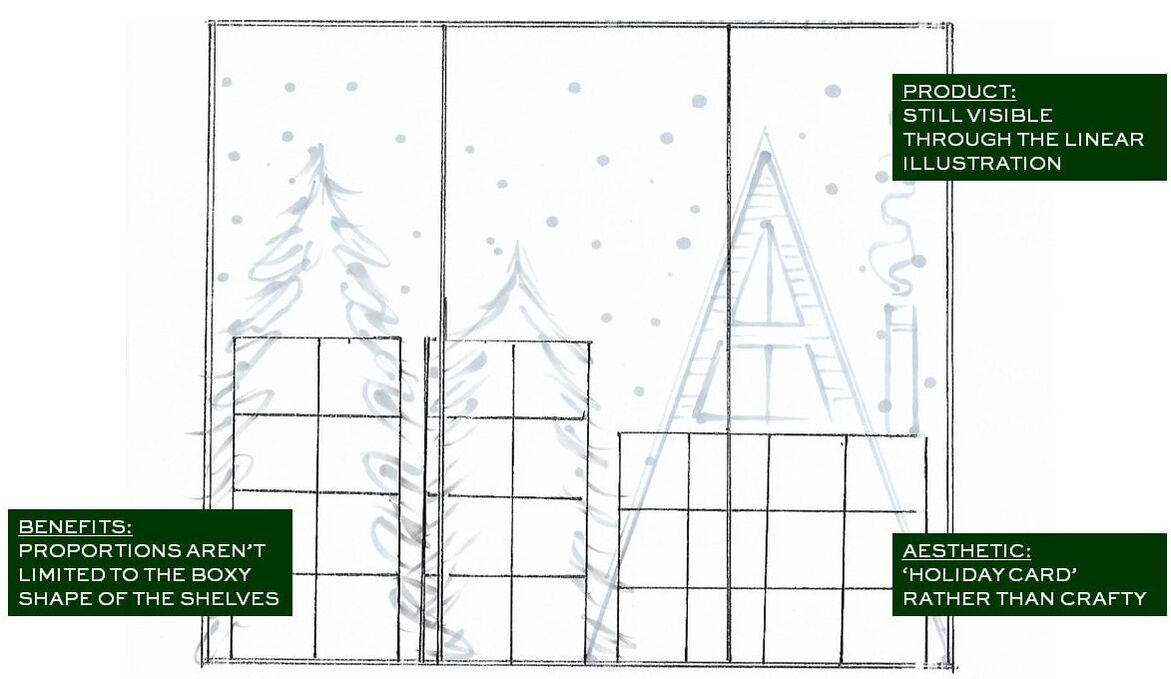
The proposed execution was inspired by the "trompe l'oiel" style, which conveys a 3D idea as a 2D illusion. By illustrating on the window and 'alluding' to the shape of the shelves behind it, it was possible to achieve the desired scenery without building physical structures. The final outcome of the proposed window is reminiscent of a nostalgic holiday card. The illustrative details add interest to the overall scene, but is balanced by the white palette, allowing product to really shine.
The proposed execution was inspired by the "trompe l'oiel" style, which conveys a 3D idea as a 2D illusion. By illustrating on the window and 'alluding' to the shape of the shelves behind it, it was possible to achieve the desired scenery without building physical structures. The final outcome of the proposed window is reminiscent of a nostalgic holiday card. The illustrative details add interest to the overall scene, but is balanced by the white palette, allowing product to really shine.
Above is an excerpt from my conceptual presentation, which is shared with Ann at project kickoff. Presentations include inspiration images, concept illustrations (to scale), as well as written rationale regarding the execution of the concept.
ANNIE'S BLUE RIBBON GENERAL STORE - Holiday 2019
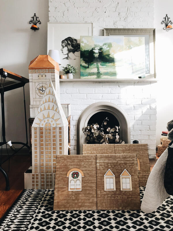
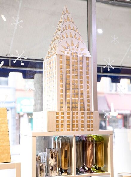
One of the most challenging window concepts to date, Annie's Holiday 2019 windows featured 3D structures built from scratch, in addition to traditional window painting. The concept was built around the phrase 'Holiday Magic in New York City,' which led to the idea of creating three 'toppers' for each of three shelving units, used to display product in the window. The toppers included the Chrysler Building (representing Manhattan), the Williamsburg Savings Bank Tower (representing Brooklyn) and finally, the Brownstones (representing iconic New York residences).
To kick off the process, concept illustrations were generated of the proposed window layout. From there, dimensions of the shelves and windows were used to determine the correct proportion of the toppers. A few calculations and sketches later, three unique patterns were ready for the construction of the structures. Next, miniature models were created of the window toppers, testing the most efficient way to build them before attempting at full scale. Once the strategy was finalized, each full size component was stenciled, painted and cut. The pieces were glued together tediously and left to dry. After carefully transporting to the store, the structures were installed on top of each shelving unit. To complete the window, snowflakes and lettering were painted on the window glass, adding another layer to the festive scene.
In tandem with the window design, the artwork was utilized on reusable shopping bags. These were distributed at Annie's Blue Ribbon General store during the holiday season. After a successful season, the 'Holiday Magic in New York City' concept was featured in Gifts & Decorative Accessories Magazine.
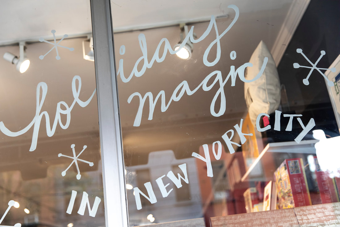
The slogan of the season, 'Holiday Magic in New York City,' was hand painted on the window in a swooping, whimsical format. The script and block lettering is my handwriting, it is not derived from an existing font.
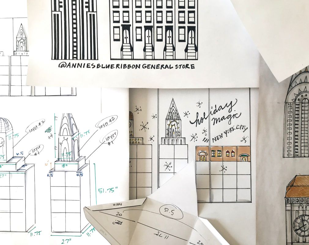
The above image shows multiple stages of the holiday window project. The sketch furthest to the left is an example of the technical sketches, used to determine overall dimensions and scale. On the bottom is an example of the miniature models built prior to the final execution. The middle sketch is a concept illustration of the initial window concept, drawn to scale. Finally, located on the far right is the detailed artwork used to create the line drawing on the toppers.
ANNIE'S BLUE RIBBON GENERAL STORE | Easter 2019 - Shoppable Windows
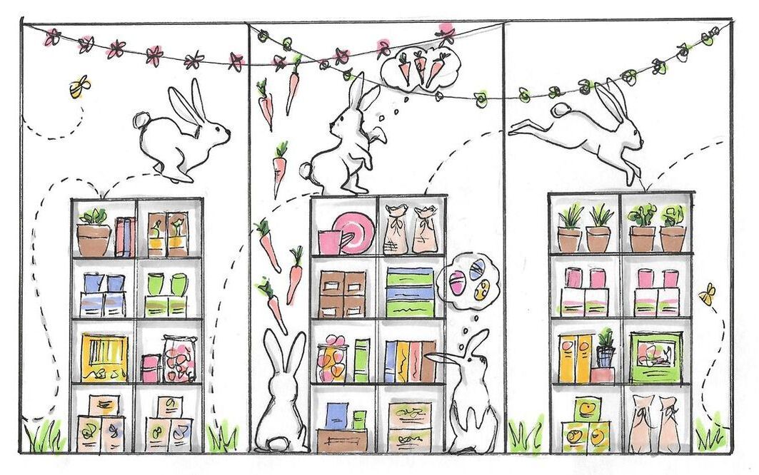
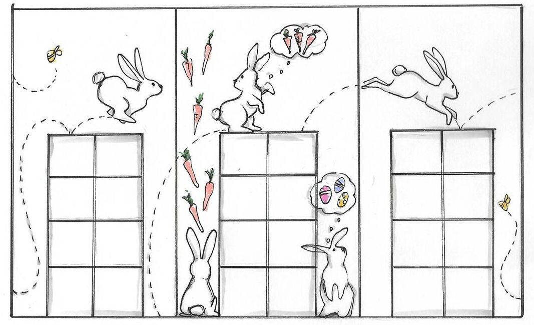
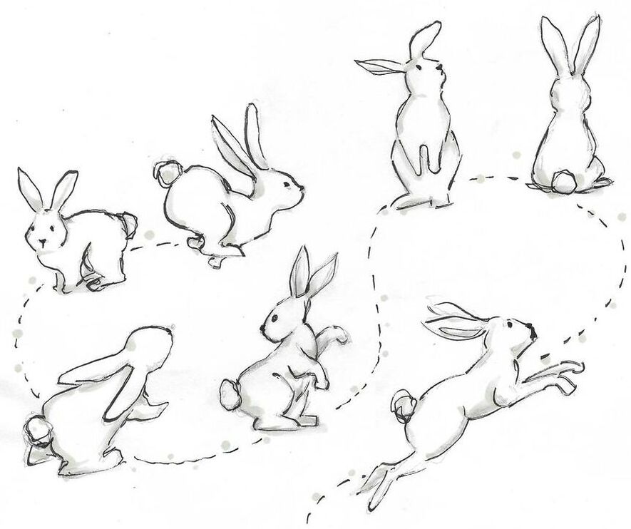
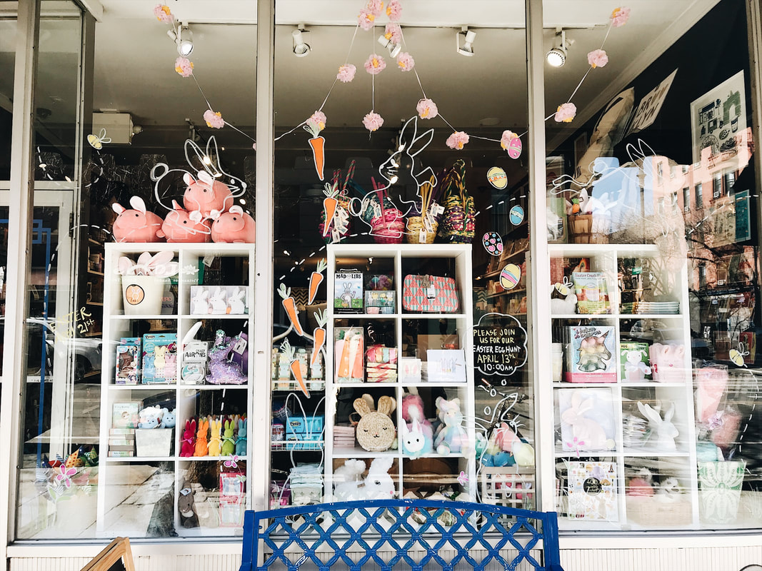
The Easter 2019 window concept utilized the shoppable window shelving, while still depicting a whimsical scene. The bunnies, bees, carrots and thought bubbles were painted on the window and positioned in relation to the shelving. The garland strung across the top of the window is a product sold at Annie's Blue Ribbon General Store.
ANNIE'S BLUE RIBBON GENERAL STORE | Holiday 2018
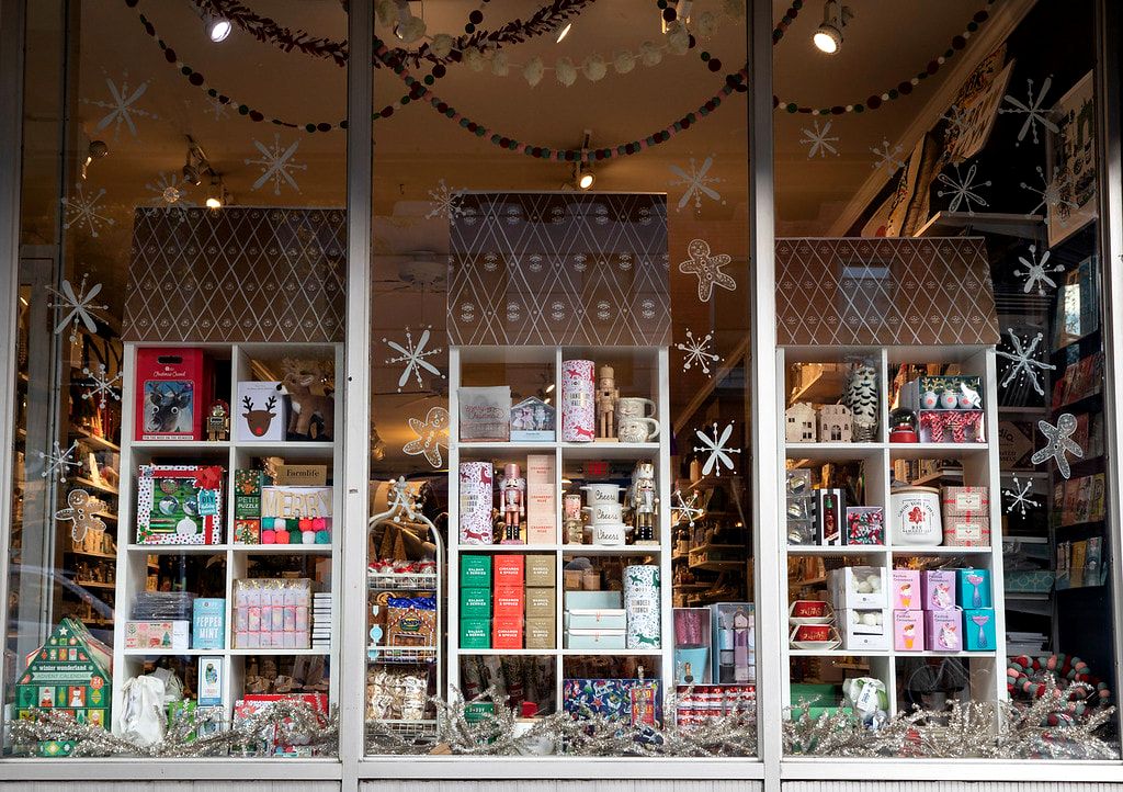
The Holiday 2018 window concept was the first time I expanded beyond the 2D realm at Annie's. I collaborated with the Annie's team to develop their idea for "shoppable windows." This design emphasized optimal use of space in order to encourage customers to shop the window from either side of the glass. For this particular concept, my task was to construct 3D gingerbread inspired roofs. These roofs were then stenciled and attached to cubed shelving units to create three shoppable towers representing gingerbread houses. In addition to the usual installation procedure, I assisted the store team in dressing the window with product. The store team confirmed the window concept was a huge success in driving sales.
ANNIE'S BLUE RIBBON GENERAL STORE | Brooklyn Water Towers - 2018
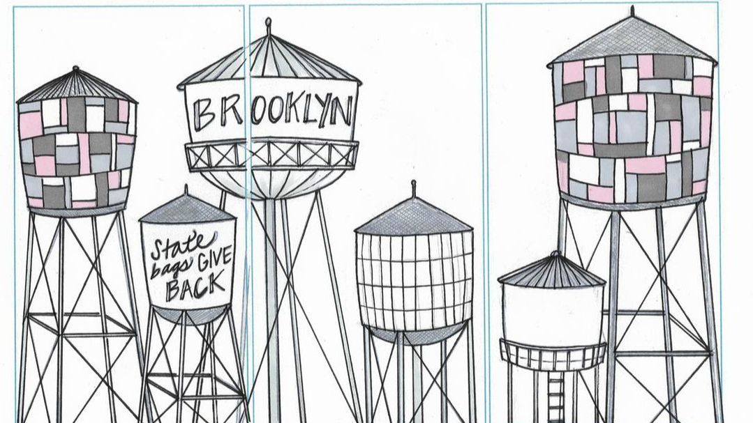
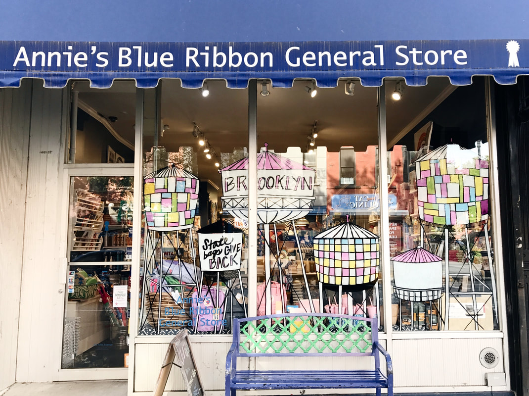
Perhaps one of my most tedious 2D windows, the Brooklyn Water Tower concept took an entire day to complete. After drawing the design on a smaller scale, I formatted the artwork to the size of the three windows and printed window stencils for installation. This allowed her paint the artwork as efficiently and accurately as possible, allowing more time to fill in the staggering surface area of the water towers. The final product was vibrant and high contrast, drawing the eye of the customer.
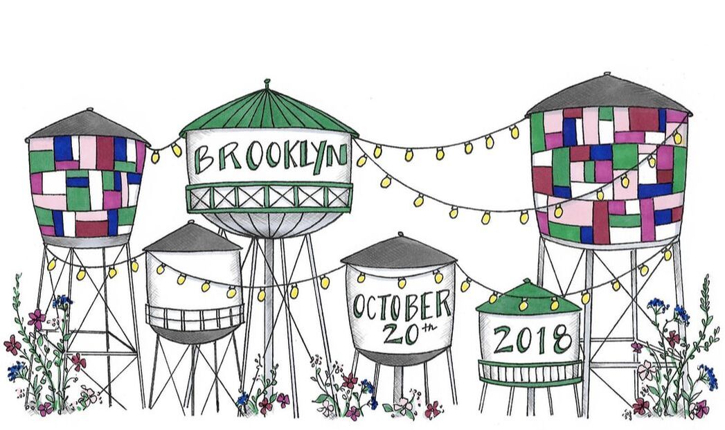
The Brooklyn Water Tower artwork was later used as wedding invitations for a local Brooklyn wedding.
The Brooklyn Water Tower artwork was later used as wedding invitations for a local Brooklyn wedding.
Shown above is the original concept illustration, drawn to scale. The illustration was scanned in high resolution and formatted for printed stencils.
The completed window installation utilized black marker for the line work in order to contrast with the white shapes and pops of color.
Above is the artwork adaptation for the Brooklyn wedding invitations. The color scheme and string lights were requested by the client.
ANNIE'S BLUE RIBBON GENERAL STORE | Easter 2018
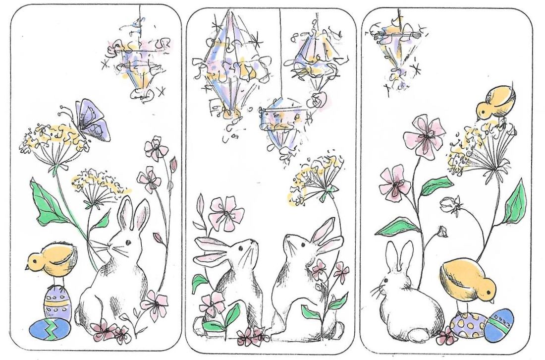
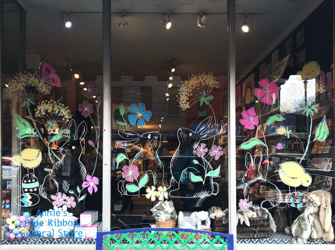
The Easter 2018 concept was based on the color scheme of iridescent party chandeliers, which were featured in Annie's Blue Ribbon General Store that spring. The style of this window employed a more sophisticated illustrative style, with lots of linear details and graceful shapes. Color was added in minimalistic ways, in order to allow the customer to be able to see into the store through the artwork.
Initial concept illustration, drawn to scale. Colors were based on direction from Ann in order to compliment her seasonal merchandise.
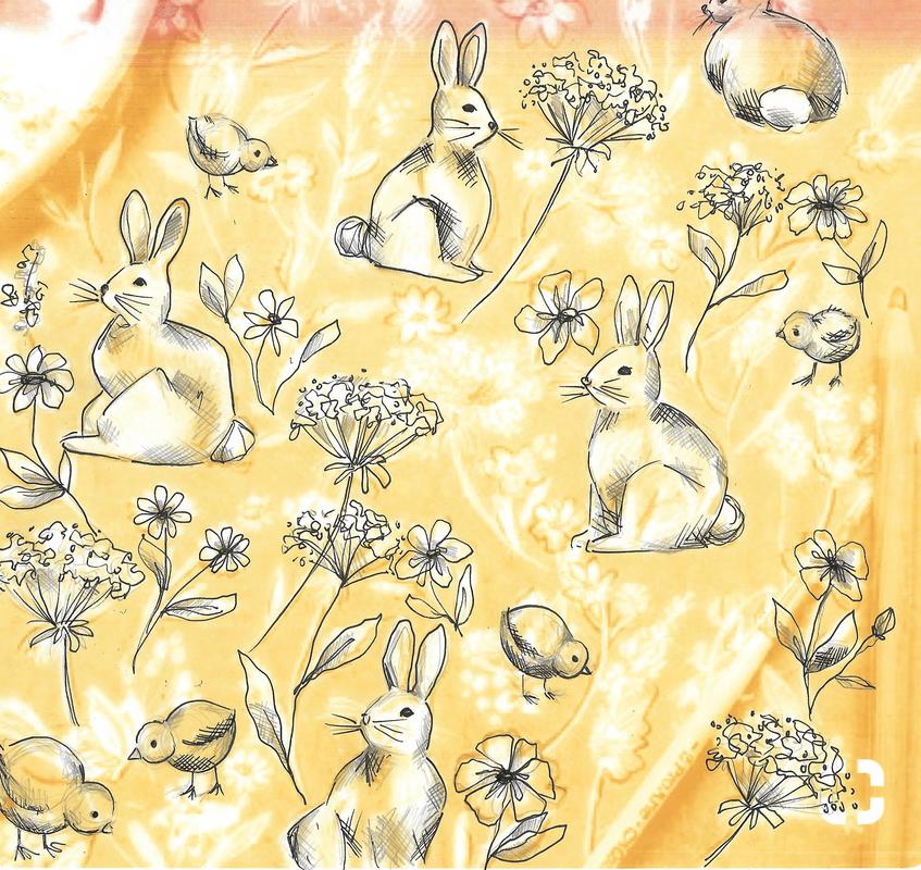
Preliminary doodles of the rabbits, chicks and flowers in order to determine the best positioning and overall illustration style.
In the final window installation, the artwork was moved up slightly in order for merchandise to be displayed at the bottom of the window.
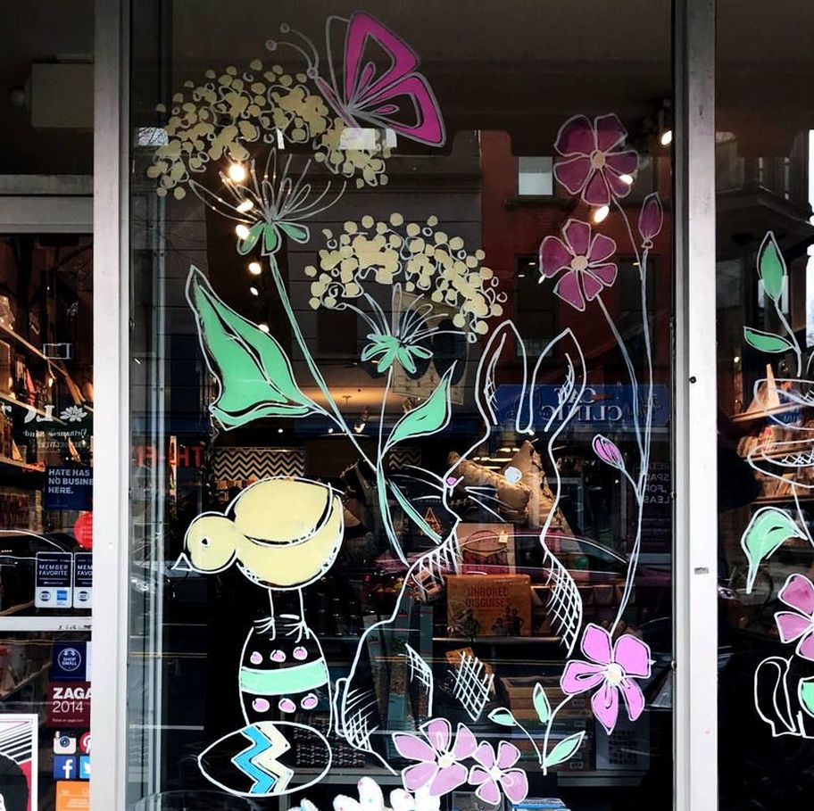
Detailed image of my illustration style. The white line work and pastel colors contrast with the darker store interior.
RALPH LAUREN X WARNER BROS. | PAN Motion Picture
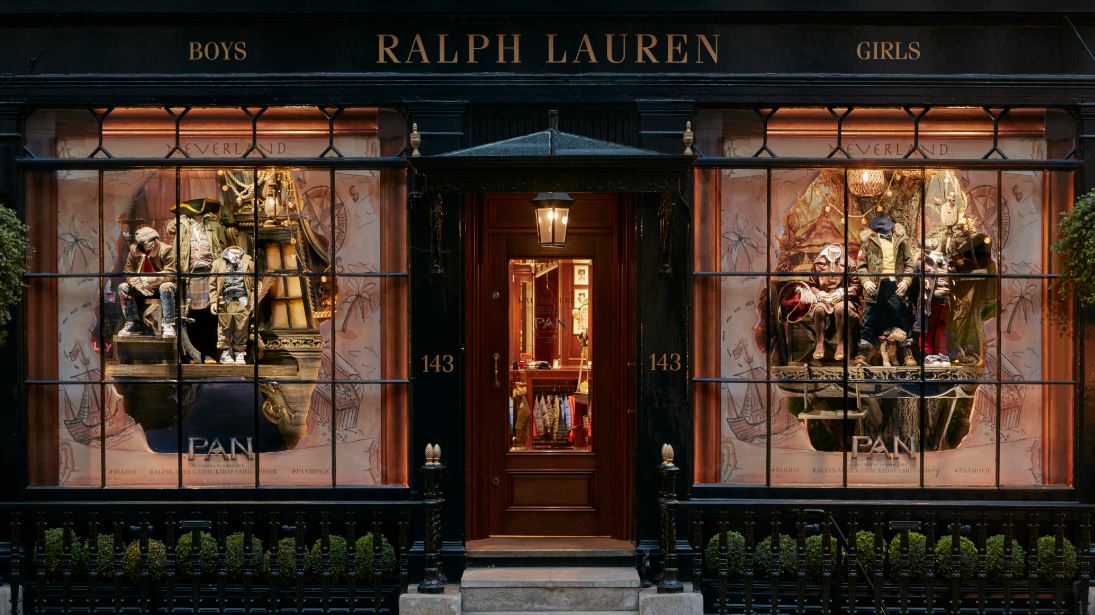
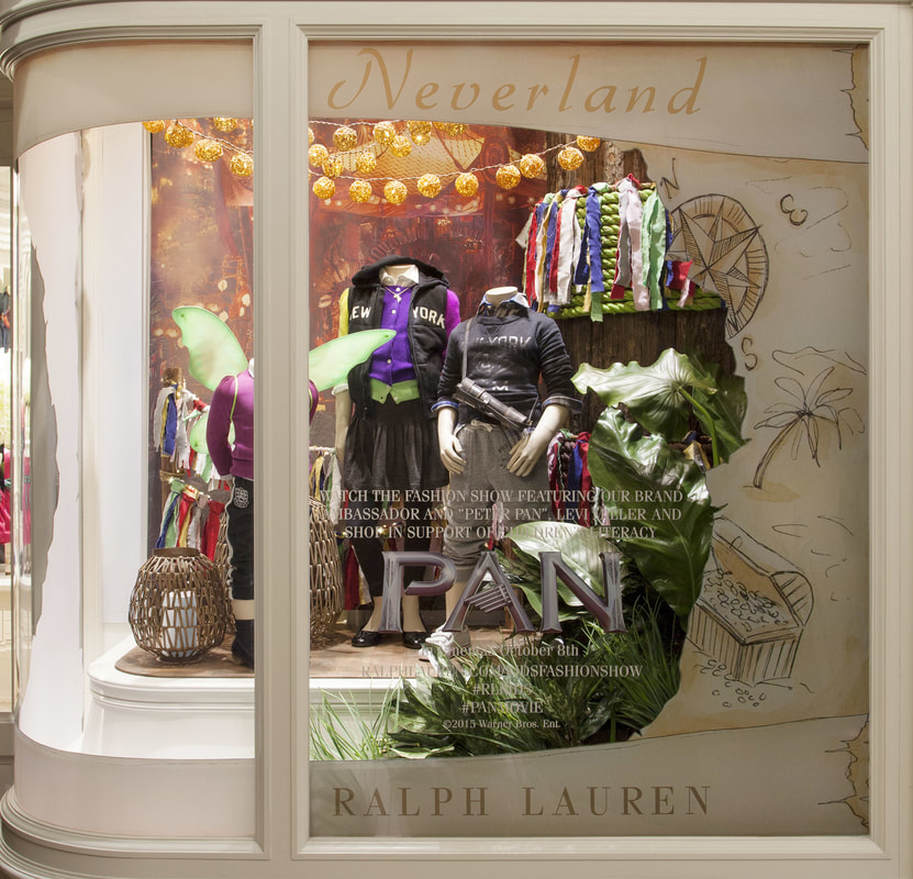
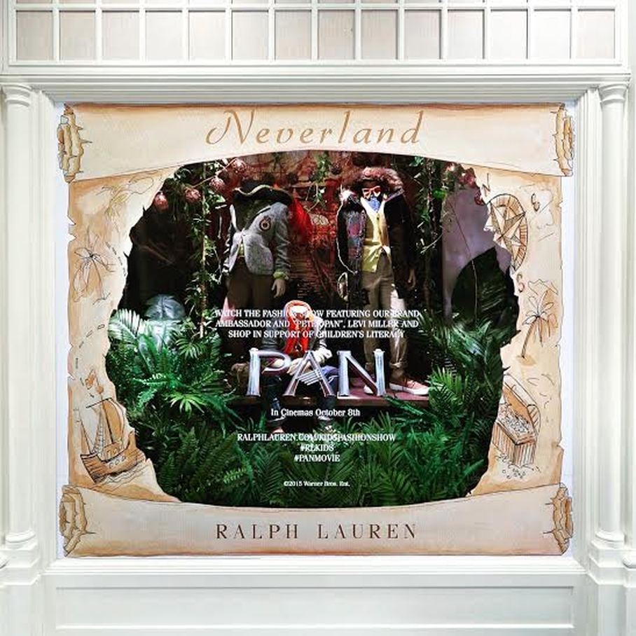
In partnership with Ralph Lauren's global window concept team and Warner Brothers Studios, I created original artwork used in the worldwide campaign for the PAN motion picture. The treasure map, done by watercolor & ink, was transformed into a window vinyl and distributed to retail doors all over the world, including London, France, Hong Kong, Malaysia and Singapore.
The above image shows my treasure map border featured in London. Original artwork was done in watercolor, pen and ink.
The image above is a closer look at the treasure map artwork, formatted for the Singapore location.
The image above shows the treasure map artwork featured in the Malaysia location.
RALPH LAUREN | Back to School 2017
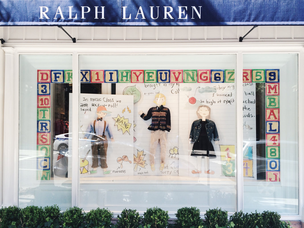
I was asked to design the whimsical border for the global "Back to School" window concept, echoing back to the nostalgia of childhood. The ABC's and 123's were done in watercolor and created into a window vinyl distributed to stores worldwide. The image below is of the Ralph Lauren Children's flagship on Madison Avenue NYC.
My artwork can be seen in the ABC border of the window. The border was rolled out to global stores.
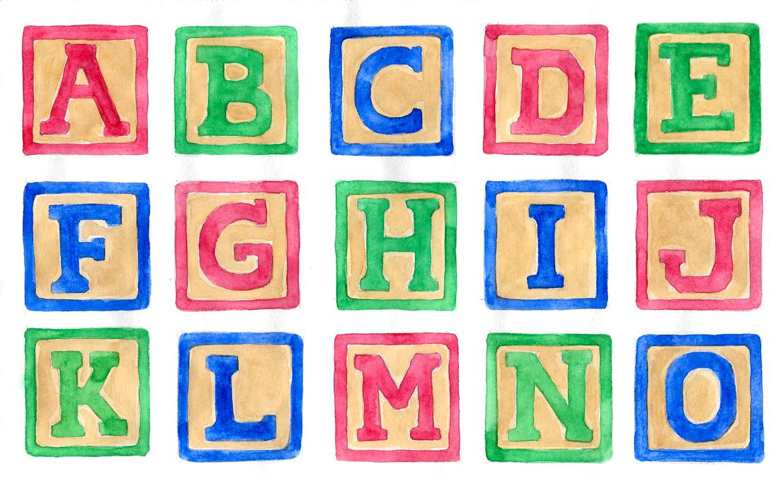
Original alphabet artwork was painted in watercolor and then scanned/formatted for global use.
RALPH LAUREN | Holiday 2015 Windows
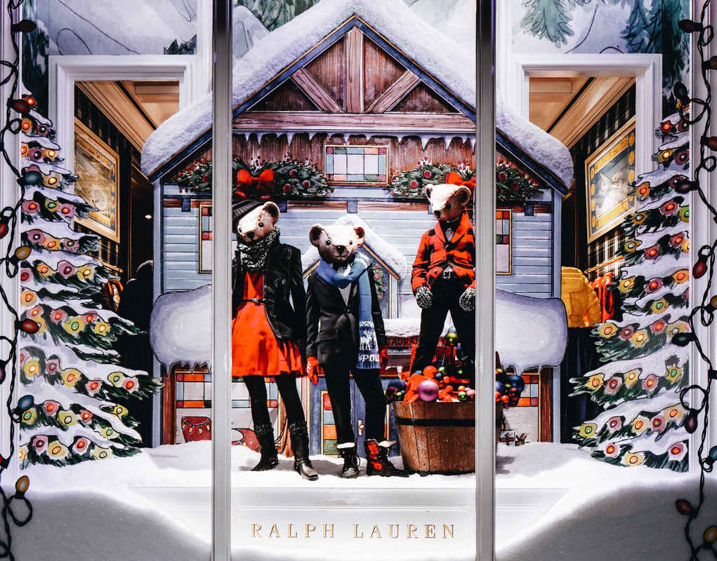
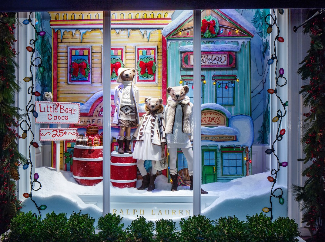
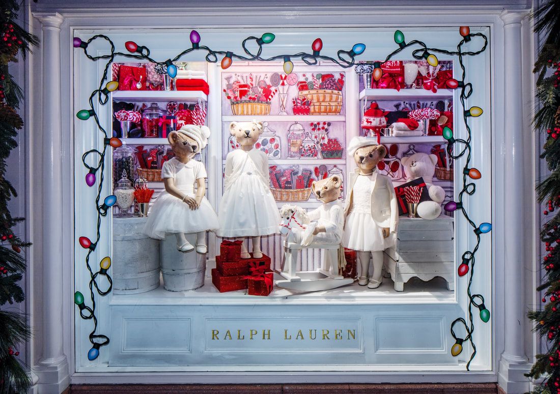
I was responsible for the conceptual creation and development of window aesthetics for Children's Holiday, as well as creating the physical artwork to be utilized in the set design. The concept was inspired by the town of Telluride, the location of Ralph Lauren's iconic ranch. Using pen, ink and watercolor, I illustrated the 2D window elements on 8.5" x 11" sheets of paper. The finished artwork was scanned in high resolution and formatted into the large structures, which were then rolled out to global stores.
In the above image, my artwork can be seen in the mountain wallpaper, evergreen trees and the Telluride storefront.
In the above image, my artwork can be seen in the two Telluride storefronts, as well as the mountain wallpaper.
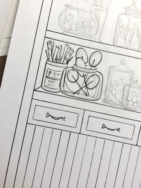
The above image was inspired by an old fashioned candy shop. I illustrated the 2D backdrop, depicting shelves filled with candy.
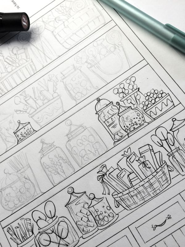
Above are examples of the 'work in progress' illustration for the backdrop, color was later added using markers and watercolor.
RALPH LAUREN | Back to School 2015
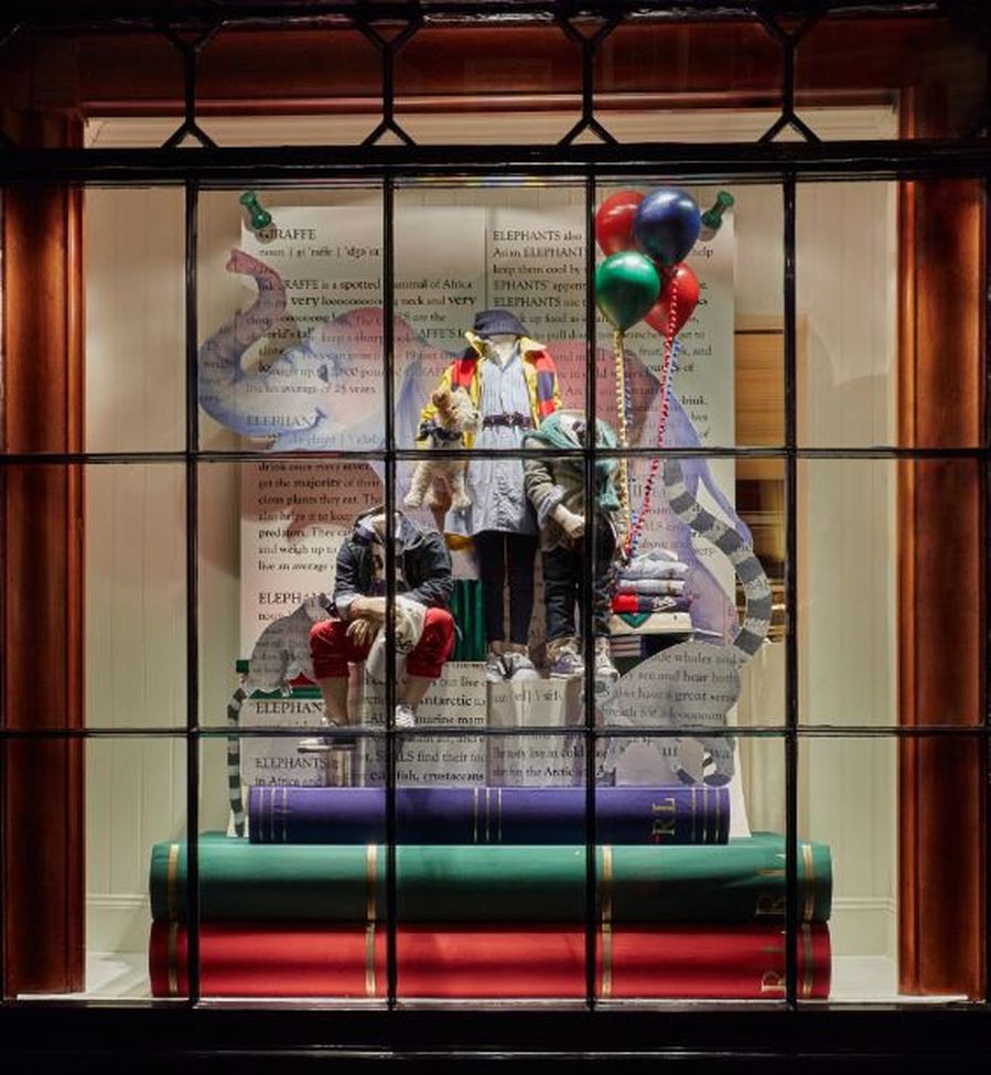
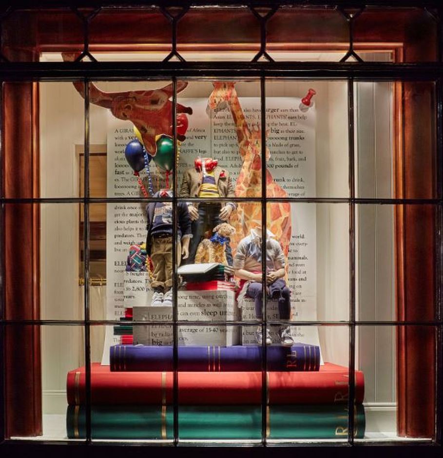
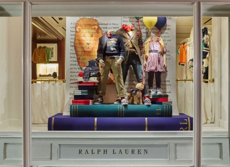
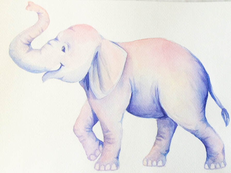
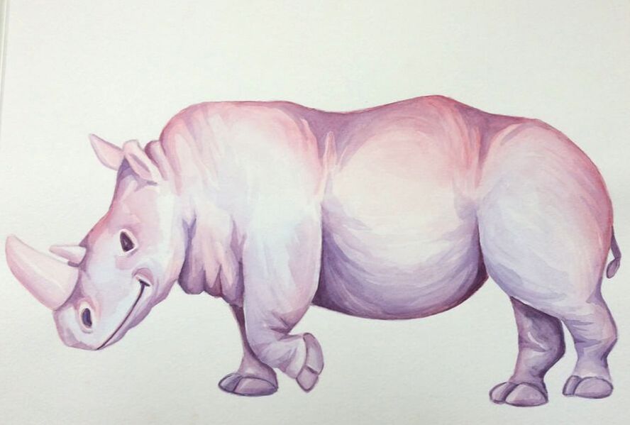
Perhaps the most pivotal project of my career, "Back to School 2015" was my first collaboration with Ralph Lauren and the catalyst for the various projects that followed. This was my first experience utilizing artwork as a means of visual merchandising, especially at a global level. The concept was "Ralph Lauren Zoo" and I was asked to create several animals to be used as set pieces in windows worldwide. This project included an array of fun subjects: an elephant, a lion, a giraffe and even a lemur. This concept acted as a marketing element to foreshadow the successful children's fashion show, held at the Central Park Zoo.
My elephant artwork in the above image was painted in watercolor and then scanned/formatted for global use.
My giraffe artwork in the above image was painted in watercolor and then scanned/formatted for global use.
My lion artwork in the above image was painted in watercolor and then scanned/formatted for global use.
Original elephant artwork can be seen above, done in watercolor on cold press paper.
Original rhino artwork can be seen above, done in watercolor on cold press paper.
SERVICES |
ABOUT |
|
